The Problem
My new signage system replaces the inconsistencies of the current system by:
• relying on imagery instead of text, especially with kids or foreign visitors in mind
• improving legibility in small or far away places
• visually differentiating from other signage
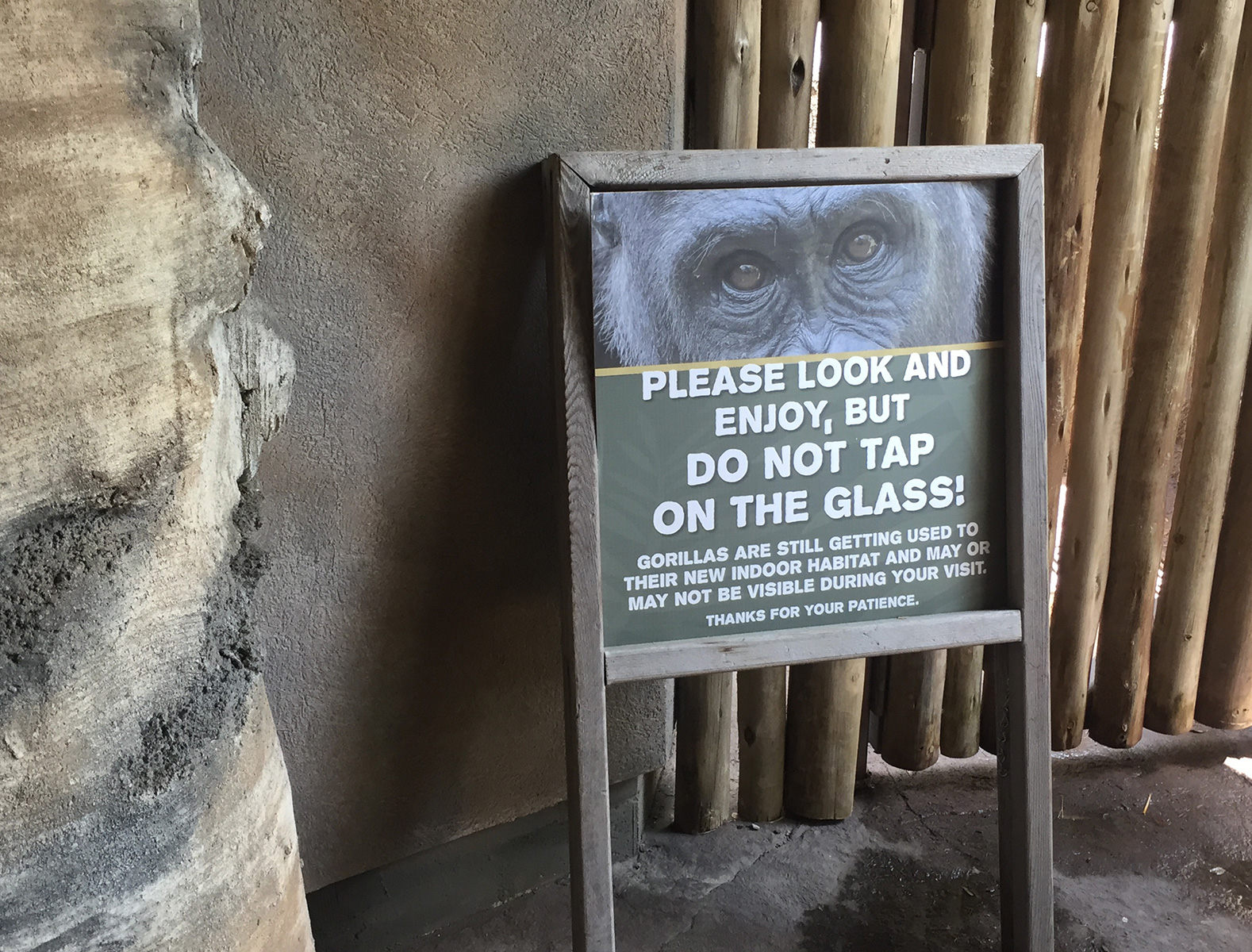

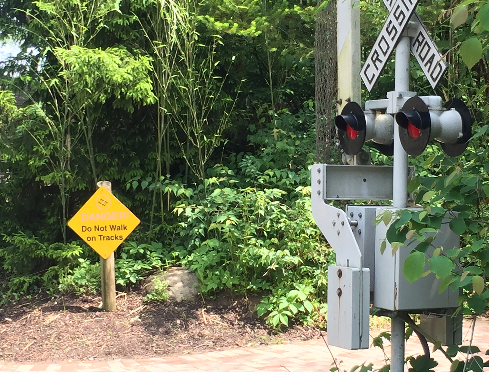
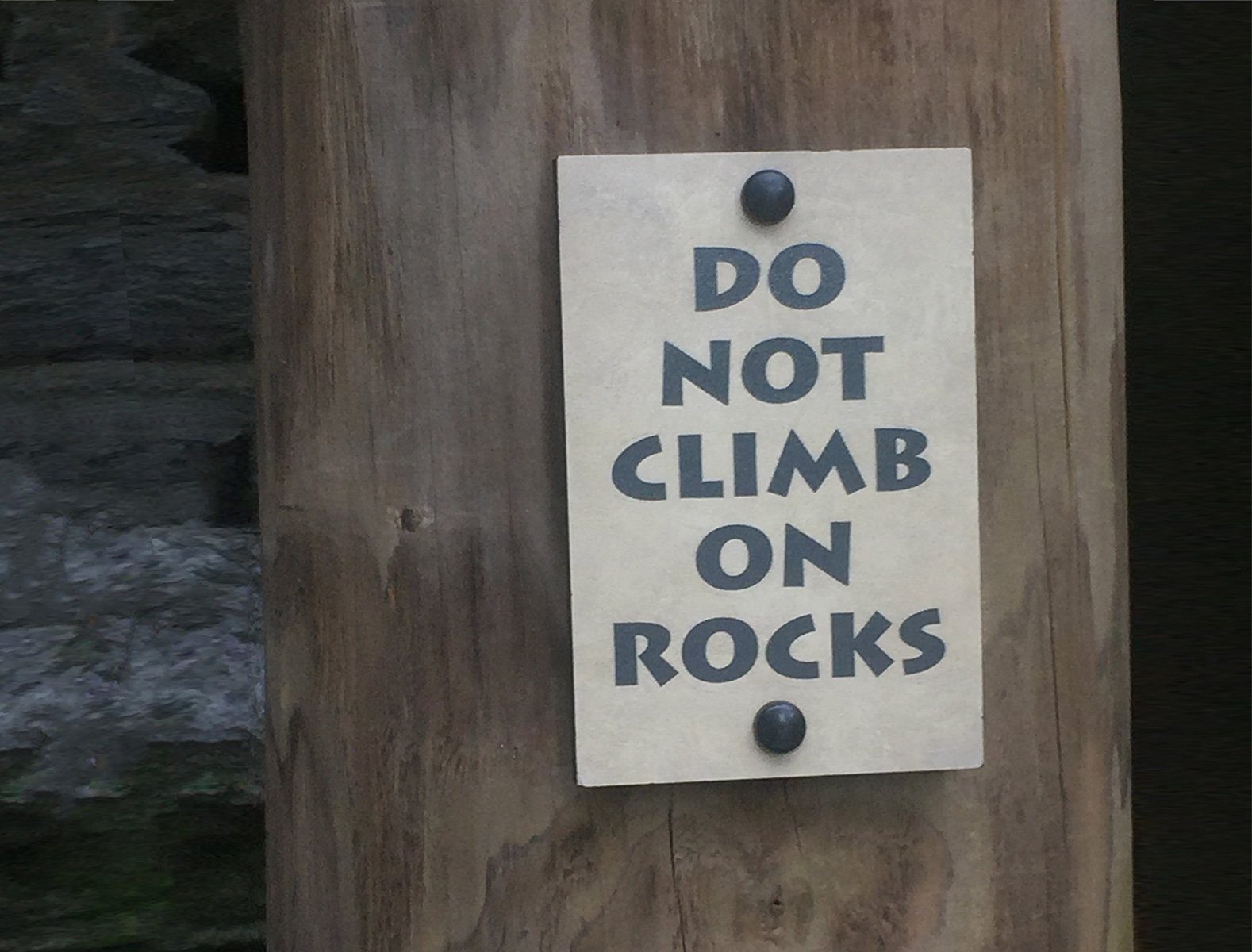
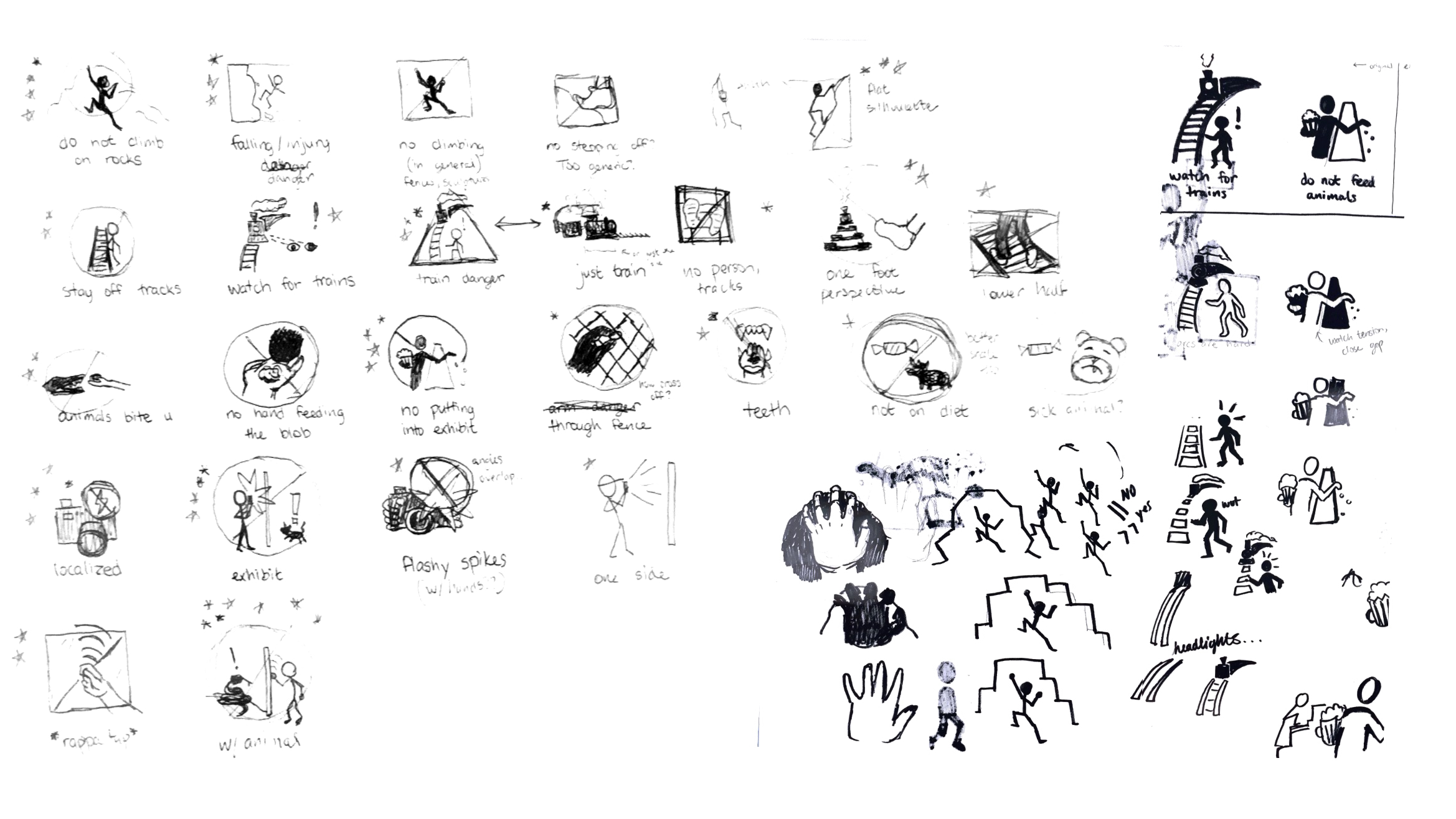
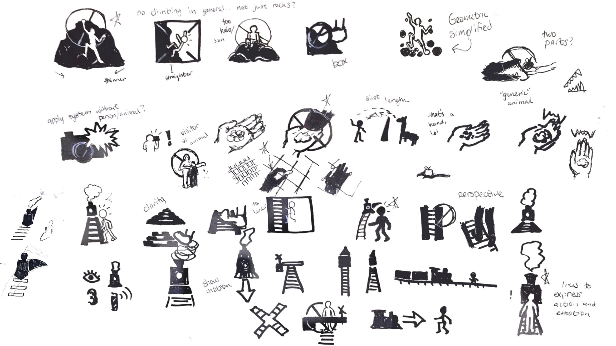
Hand Sketching
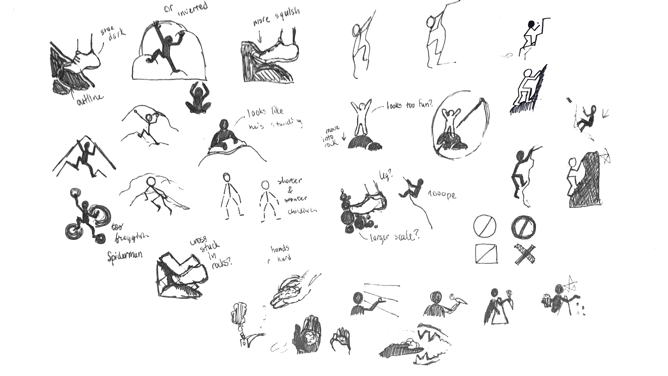
In the first sketches, focus was put on the connotation behind implied actions of the icons. I didn't want to make climbing on rocks look fun, but also didn't want to depict someone getting hurt because of the action. Finding the appropriate graphic style for a serious matter that has to appeal to everyone was a challenge as well.
Digitalizing
Iterating through the best way to depict the prohibition symbol, graphic style, as well as complexity at a small scale was easier in digital form.
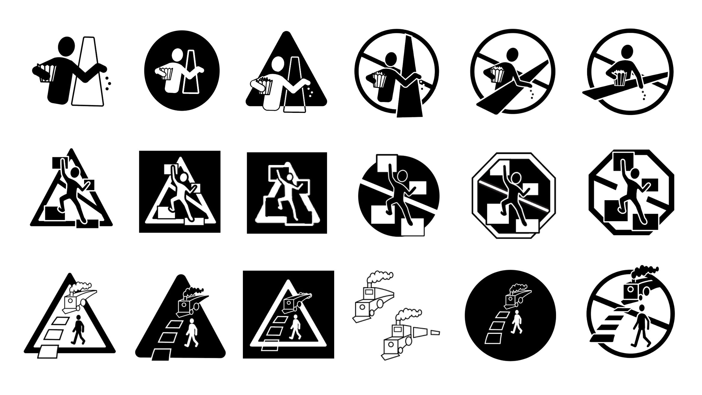
Once the style was solidified, user-testing variations of the icons helped determine if they were communicating the correct action.

Final Icons
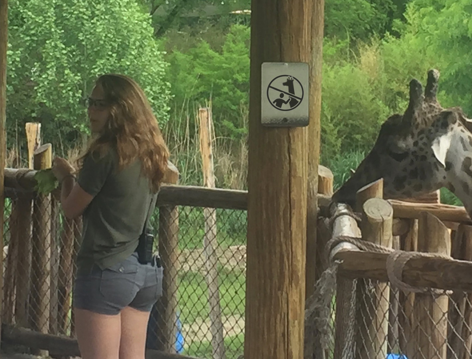
no feeding animals
no climbing
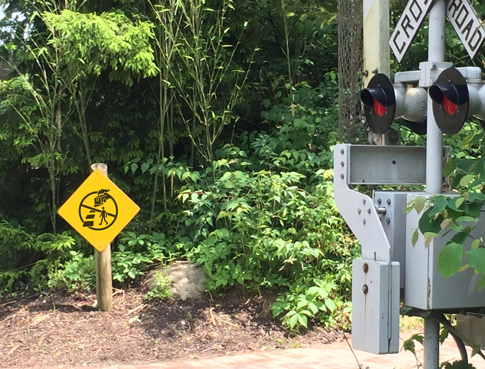
watch for trains
no sitting on fence
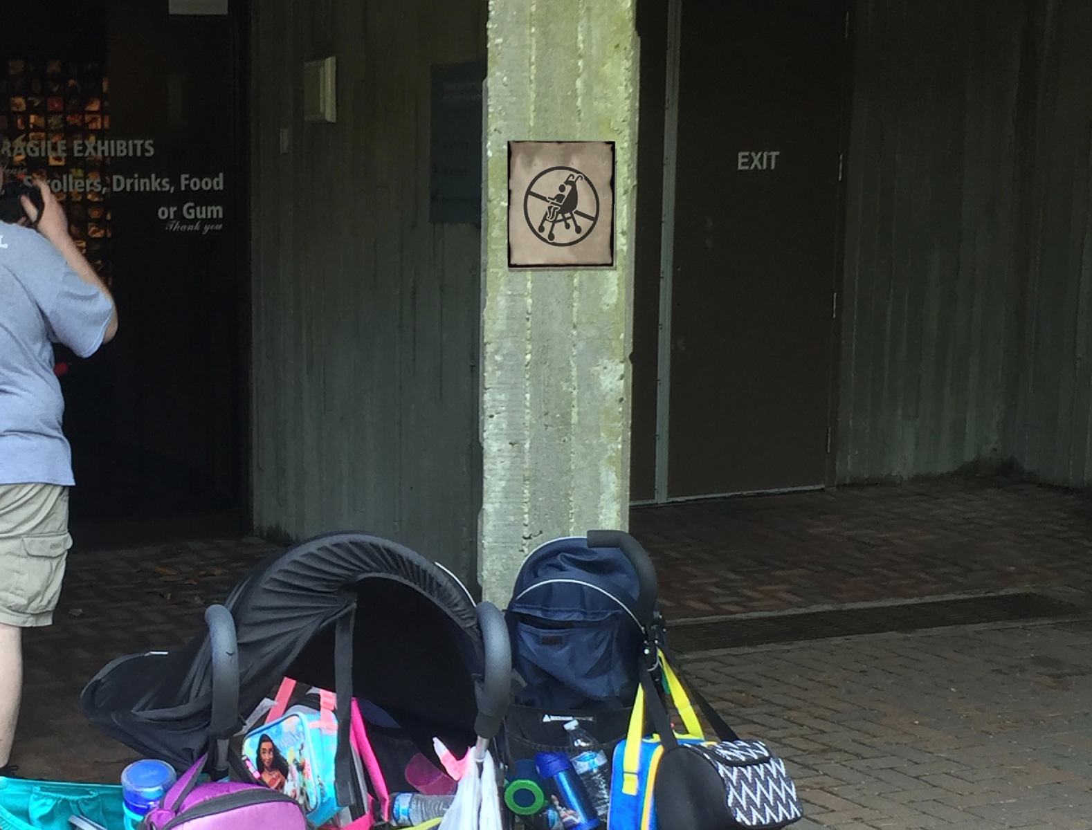
no strollers
watch for vehicles
electrical danger
no flash photography
no touching the animals
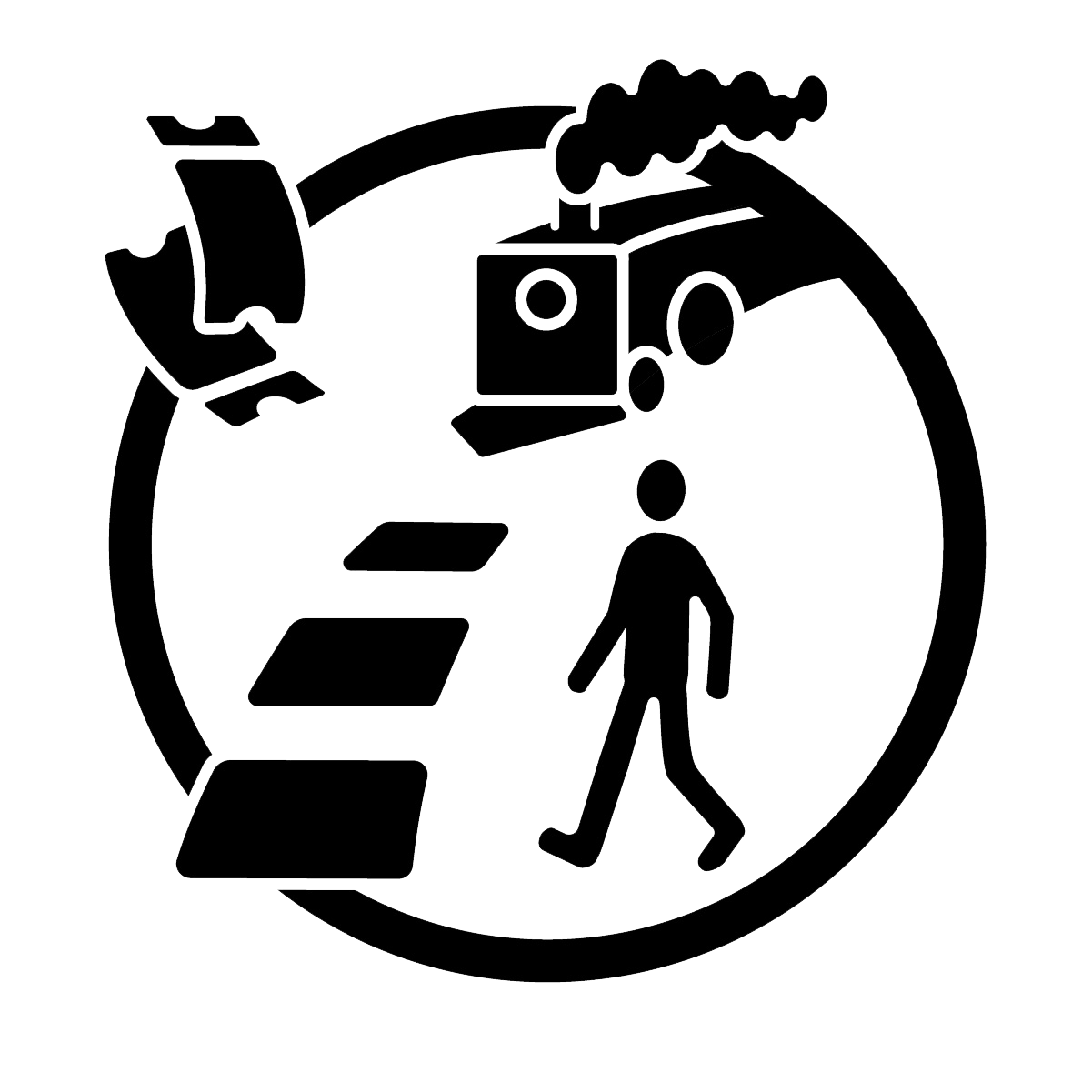
Rebus: train ticket sales
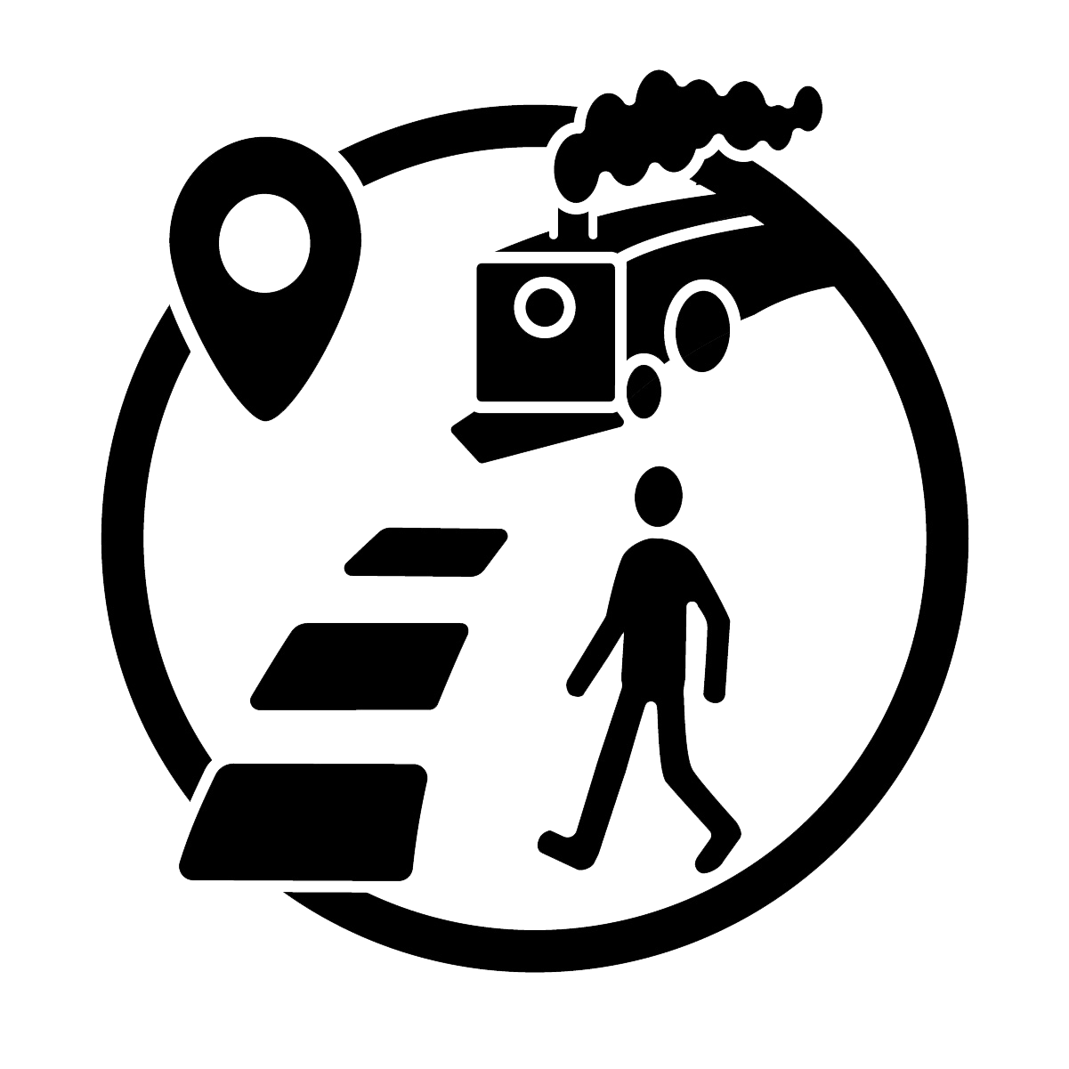
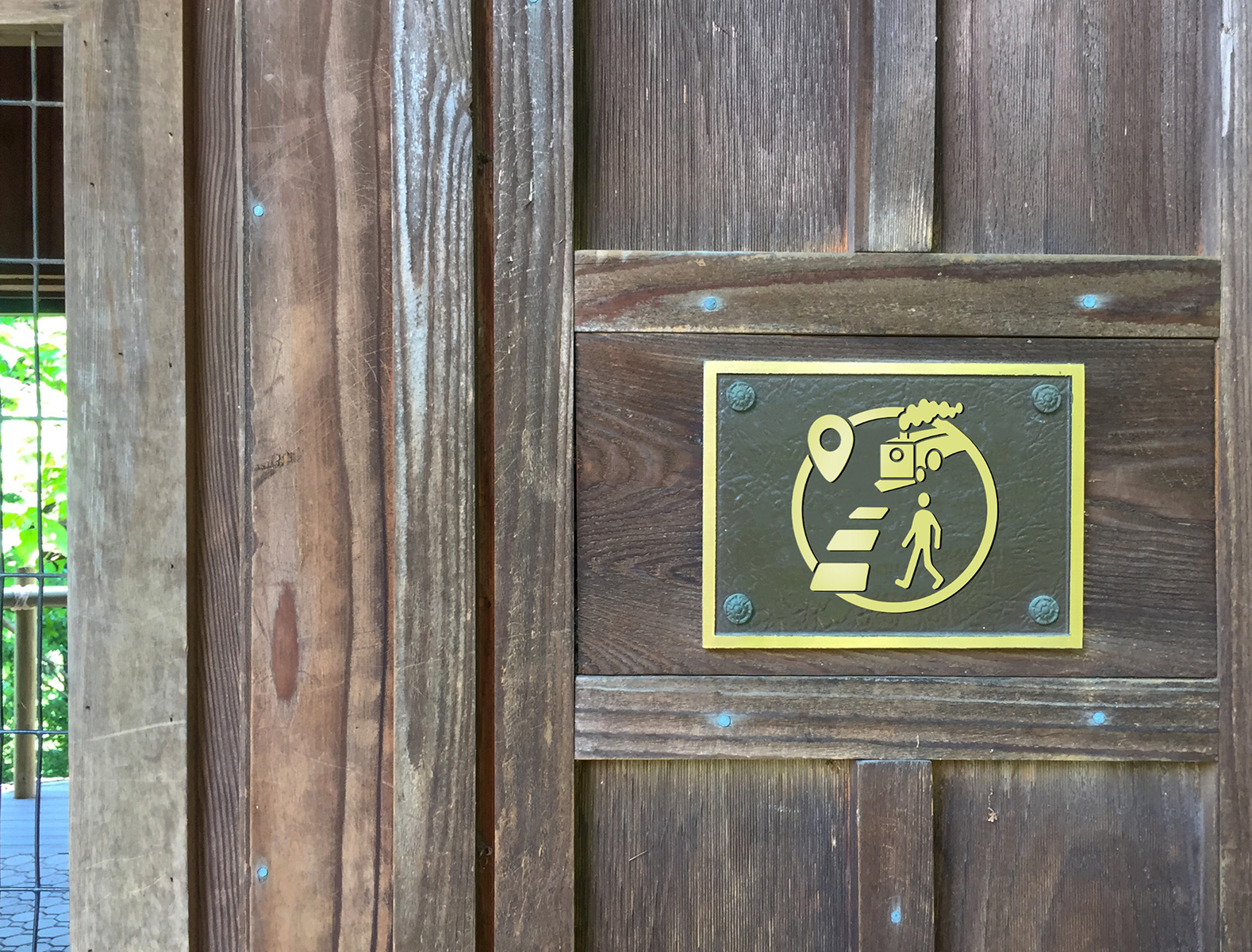
Rebus: train stop
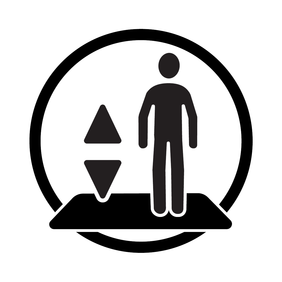
Utilitarian: elevator
Possible Zoo Applications
